使用Pandas和matplotlib库进行简单的数据分析与可视化
Introduction
Pandas 是 Python 语言的一个扩展程序库,用于数据分析。
Matplotlib is a comprehensive library for creating static, animated, and interactive visualizations in Python. Matplotlib makes easy things easy and hard things possible.
本文章将会对一些数据data.csv进行处理与绘图,形如:
| Idx | Title of Book | Description | Authors | Rating | Price | Availability | Book Category |
|---|---|---|---|---|---|---|---|
| 0 | It’s Only the Himalayas | Wherever you go, whatever you do, just . . . don’t do anything stupid. | S. Bedford | 2 | 45.17 | 19 | Travel |
Analysis
Read File
利用pd.read_csv完成读取,指定index_col字段,以指定数据随后所使用的索引。
1 | import matplotlib.pyplot as plt |
Group by
对dataframe对象使用.groupby()可以对数据进行合理的归并分组,是一个pandas.core.groupby.generic.DataFrameGroupBy 对象
.size()
对.size()字段可以得出各个分组的名称和对应大小(数量),是一个pandas.core.series.Series对象
1 | dfcand.groupby('Book Category').size() |
Series对象
.sort_values(ascending=False)
对Series对象,.sout_values()可以规定其排序方式
1 | piedata = dfcand.groupby('Book Category').size().sort_values(ascending=False) |
一般的,对于Series对象,可以利用比较符号进行筛选,例如,我们要获得以上大于7的值
1 | abovepiedata = piedata[piedata>7] |
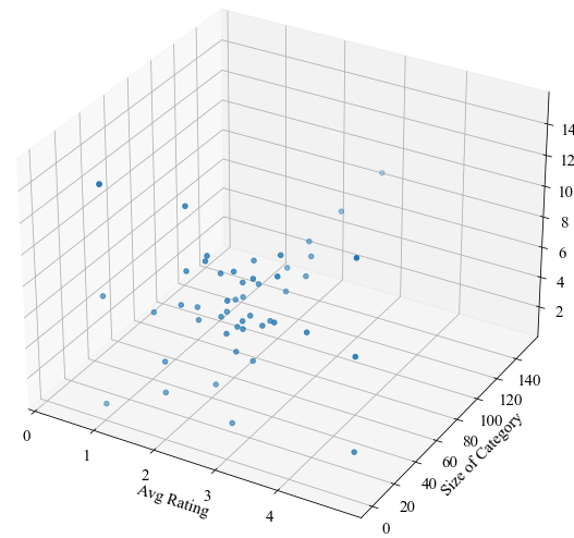
pd.concat()
可以使用此方法将多个Series对象合成为dataframe对象
当axis = 1时,如果其索引一样,会将合并的Series作为新的列,最终合并为dataframe
1 | pd3d = pd.concat([ratingseries,availabilityseries,sizeseries],axis= 1,ignore_index= False) |
对于合并后可能出现的未命名列,可以使用.iloc 获取,例如
1 | pd3d.iloc[:,2] |
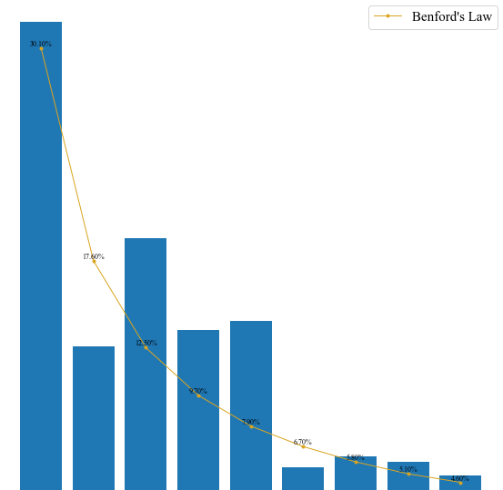
Benford
By Benford’s law it is often the case that 1 occurs more frequently than 2, 2 more frequently than 3, and so on. This observation is a simplified version of Benford’s law. More precisely, the law gives a prediction of the frequency of leading digits using base-10 logarithms that predicts specific frequencies which decrease as the digits increase from 1 to 9.
1 | frequency = {'1':0,'2':0,'3':0,'4':0,'5':0,'6':0,'7':0,'8':0,'9':0} |
Draw diagrams
General
1 | plt.figure(figure = (10,10) #规定画布的大小 |
Pie
对Series对象,可利用.values获取其值
利用plt.pie()绘制饼图
第一个参数提供数据
labels = 提供对应数据的标签
startangle = 规定第一个刻度的角度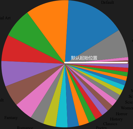
labeldistance = 规定标签到饼图的距离
1 | plt.pie(abovepiedata.values,labels=abovepiedata.index,startangle= 32,labeldistance= 1.12) |
3D Scatter
1 | ax = plt.axes(projection = '3d') #规定为3D散点图 |
Bar & Plot
plt.bar() 中,x = 提供了数据的条目(有几列数据)
1 | plt.bar(x=range(len(benser)), height=benser, label='Data', tick_label = benser.index) |